Journey 10th Anniversary Behind the Scenes Retrospective
On the 10th anniversary of the Journey’s release, I posted a thread on twitter with behind the scenes content from it’s development. I’ve replicated it here:
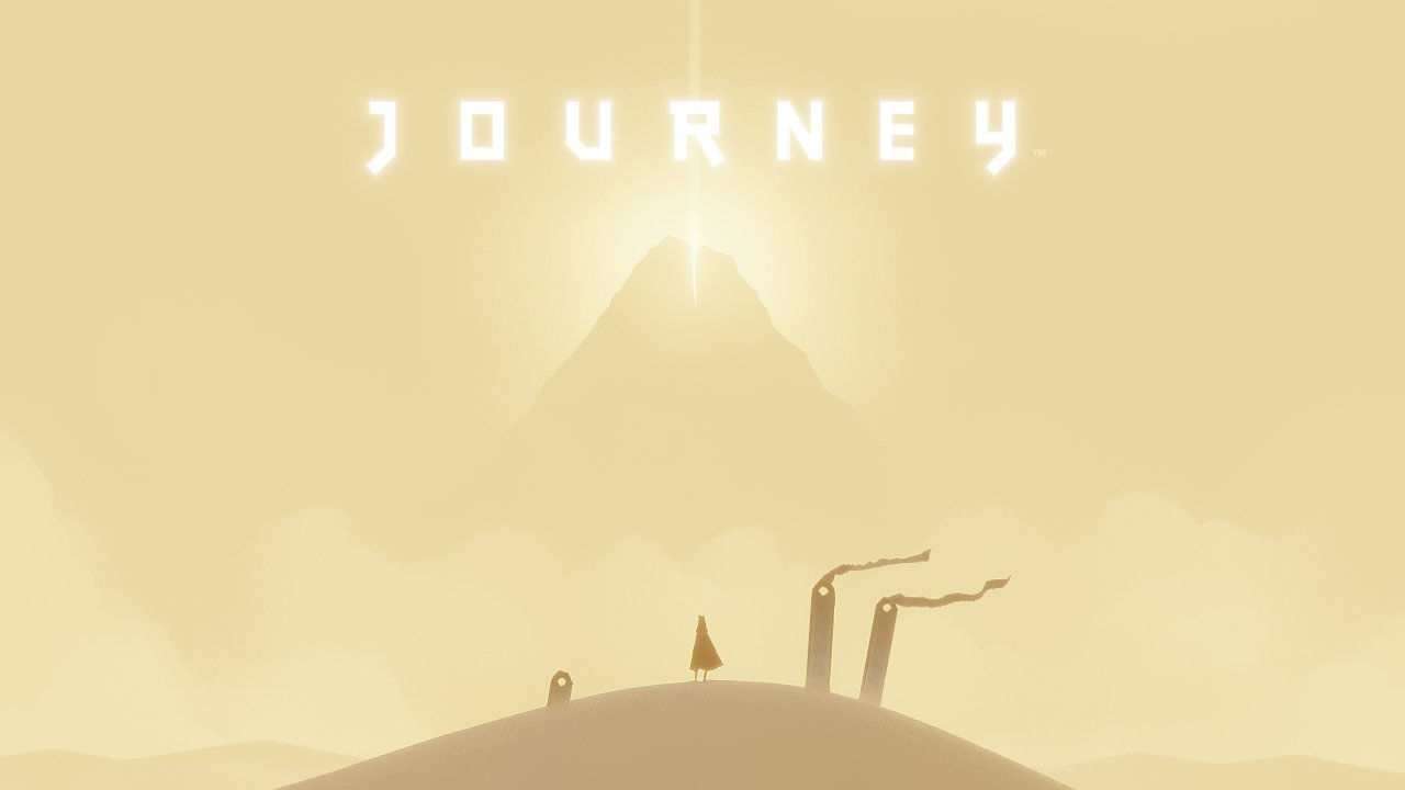
10 years ago today thatgamecompany released Journey. I was the art director. It set the course of my career and my art. I'm forever thankful to the community of players and their incredible love for the game. This is a thread comparing early dev images and how things shipped.

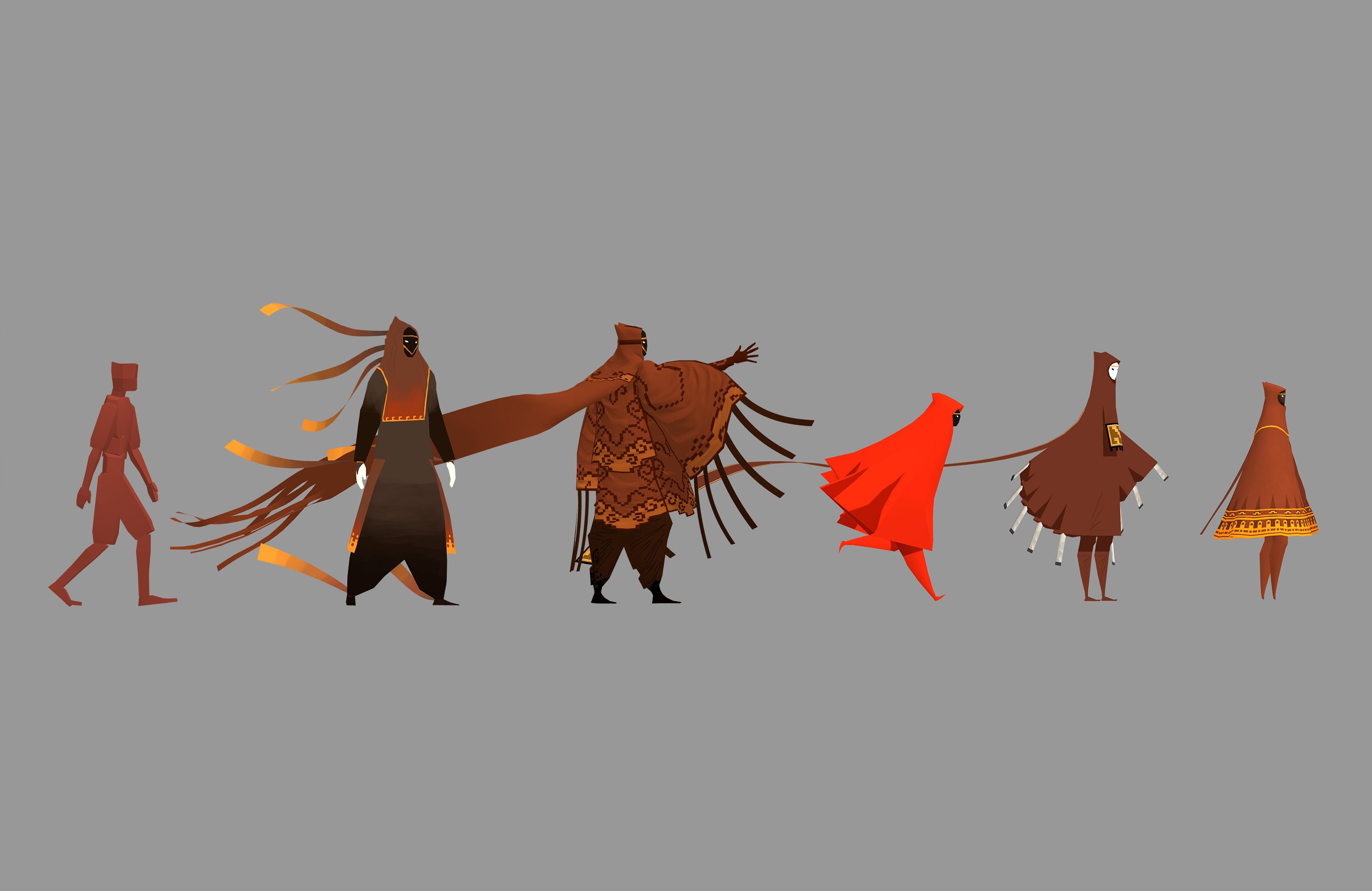
Every character here was playable at one point in an early version of the game. I went from humanoid to very detailed, and back to as minimal as possible. Each iteration was an important step in finding the final design.
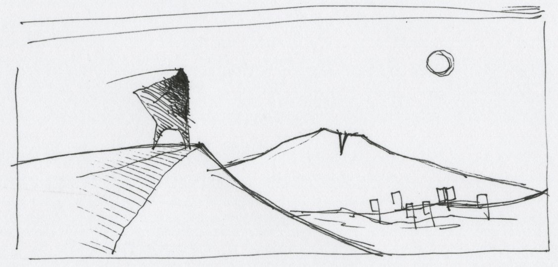
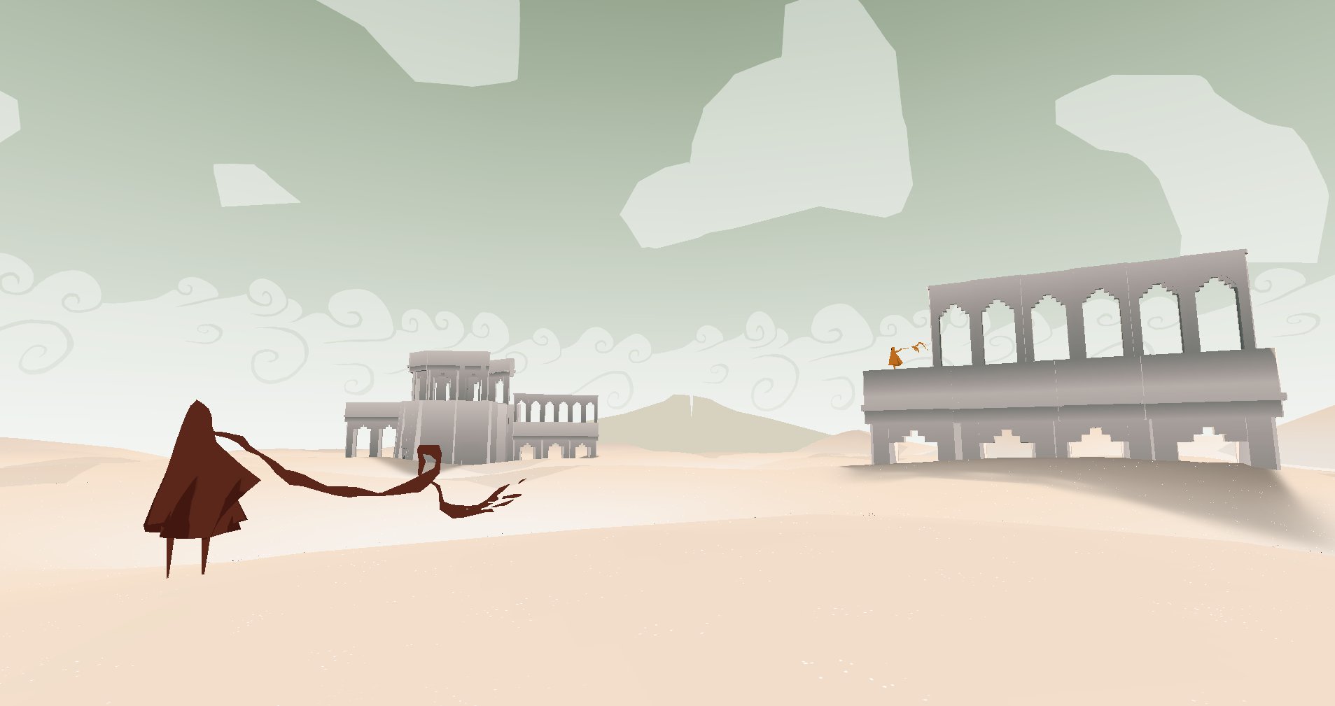
Here's the desert scene vs a painting and 3D prototype I made. I wanted to save bright blue skies for the ending of the game as a reward, so I put a green sky in this earlier scene.

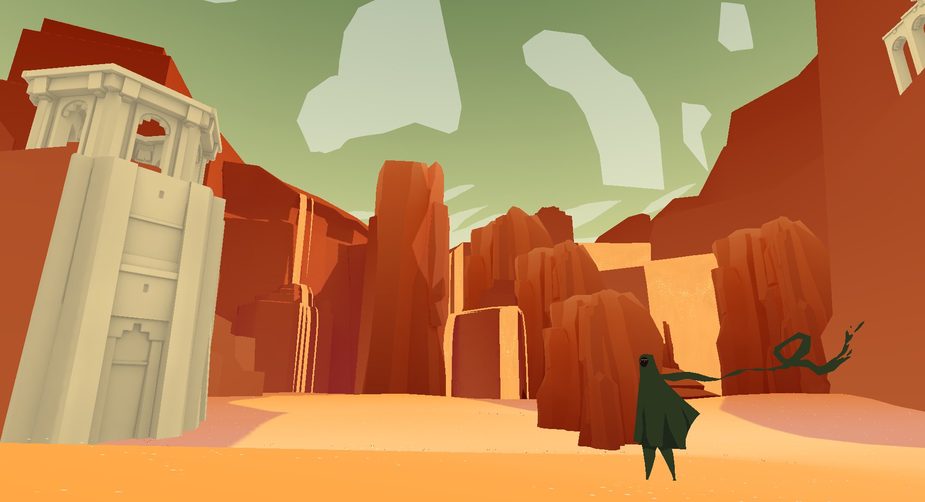
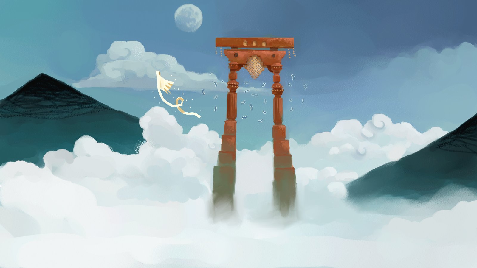
Rock arch concept I painted vs the location in the surfing game level.

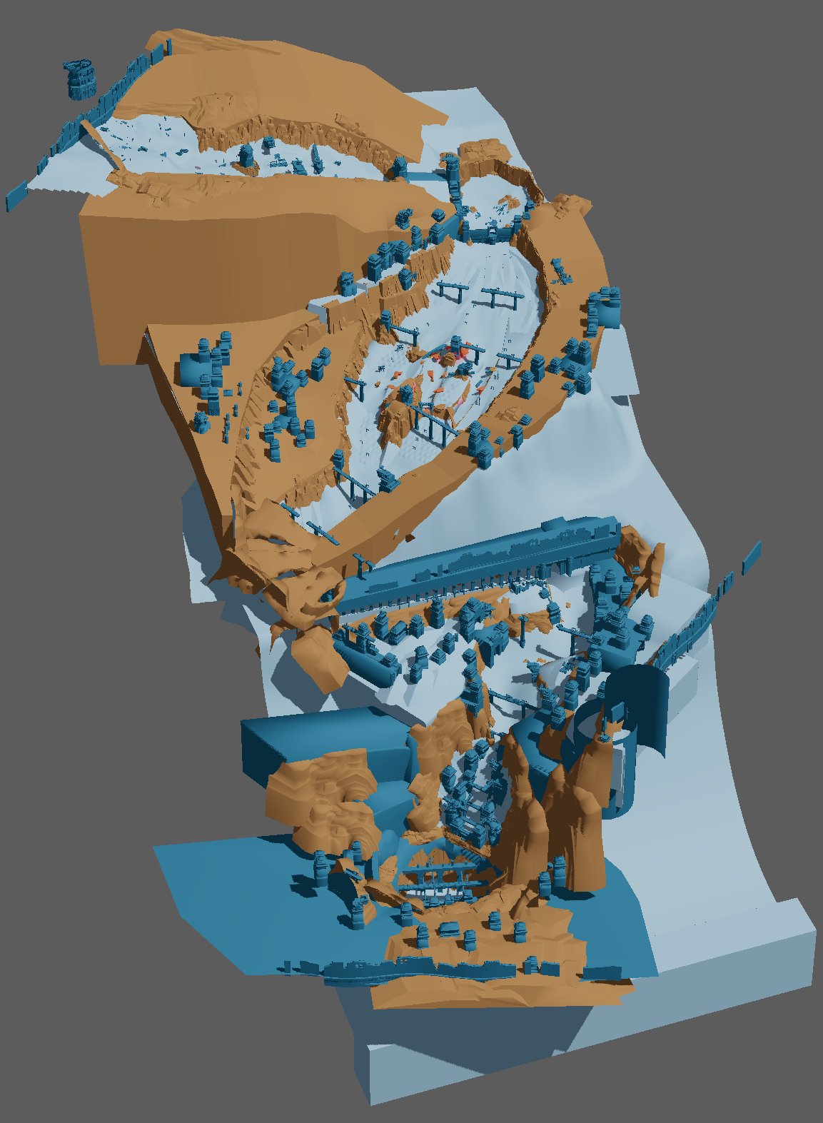
Here is how the surfing level looked in our editor. This was one of the most complex levels to build. I spent so much time tweaking the angle, position, and shape of every ramp and gully.
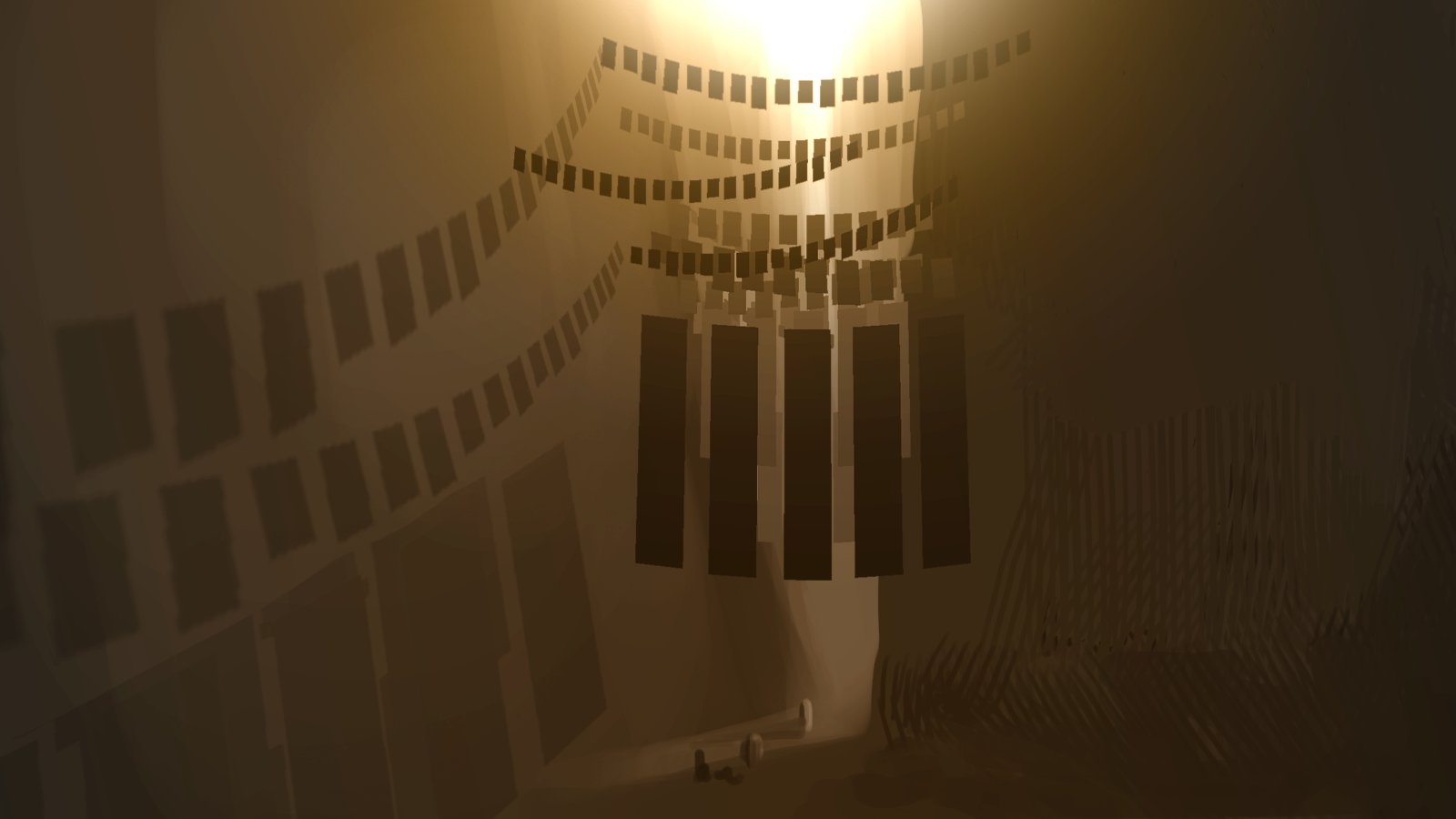
Funny story: Journey had no automatic shadows. I painted them all by hand. The shadow texture was not hi res. To get the iconic sunset columns to cast sharp shadows, I made sure that they aligned with the pixel grid of the texture. Here you can see the shadow map I painted.

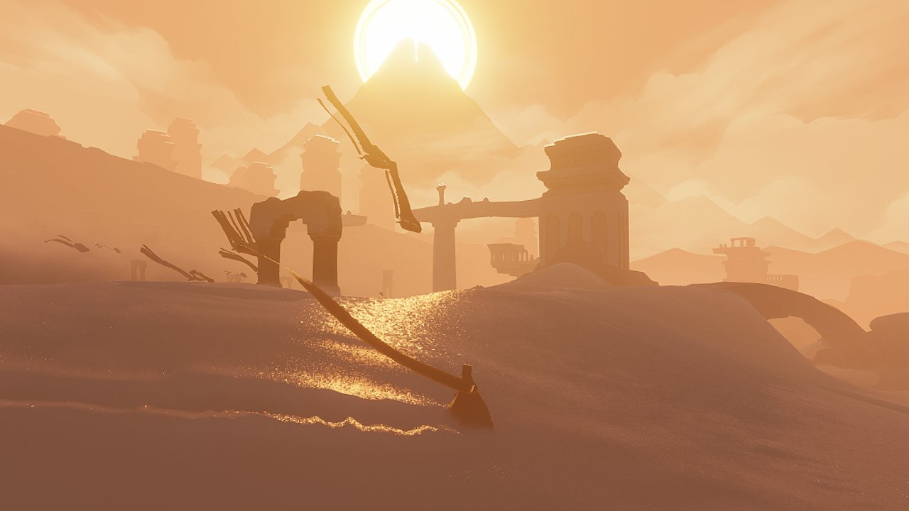
Sliding through the canyon ruins. One of my pencil drawings, a colored concept piece and the final area in the game.
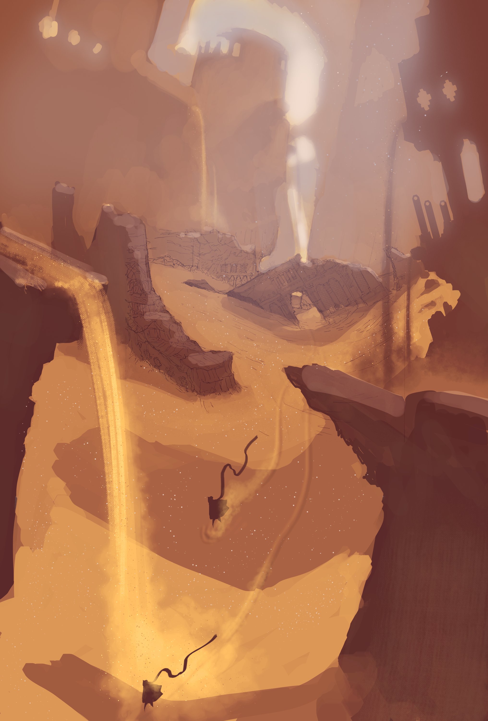

There was a time when the surfing canyon and the open desert were a single level in our concepts. This piece was done at that early time. Its a 3D visual mockup where I was thinking about the visual style of the game. We always tried to do the most with the least.
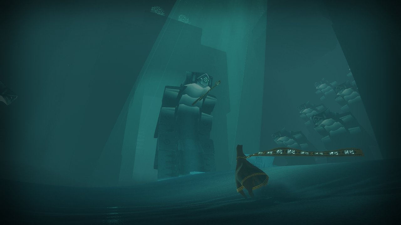
The scary underground area vs the 3D mockup and concept I made for it. This scene almost got the game a Teen rating because reviewers thought there were blood effects. We changed the color of some particles to be less red to get an E rating. It was supposed to be cloth!
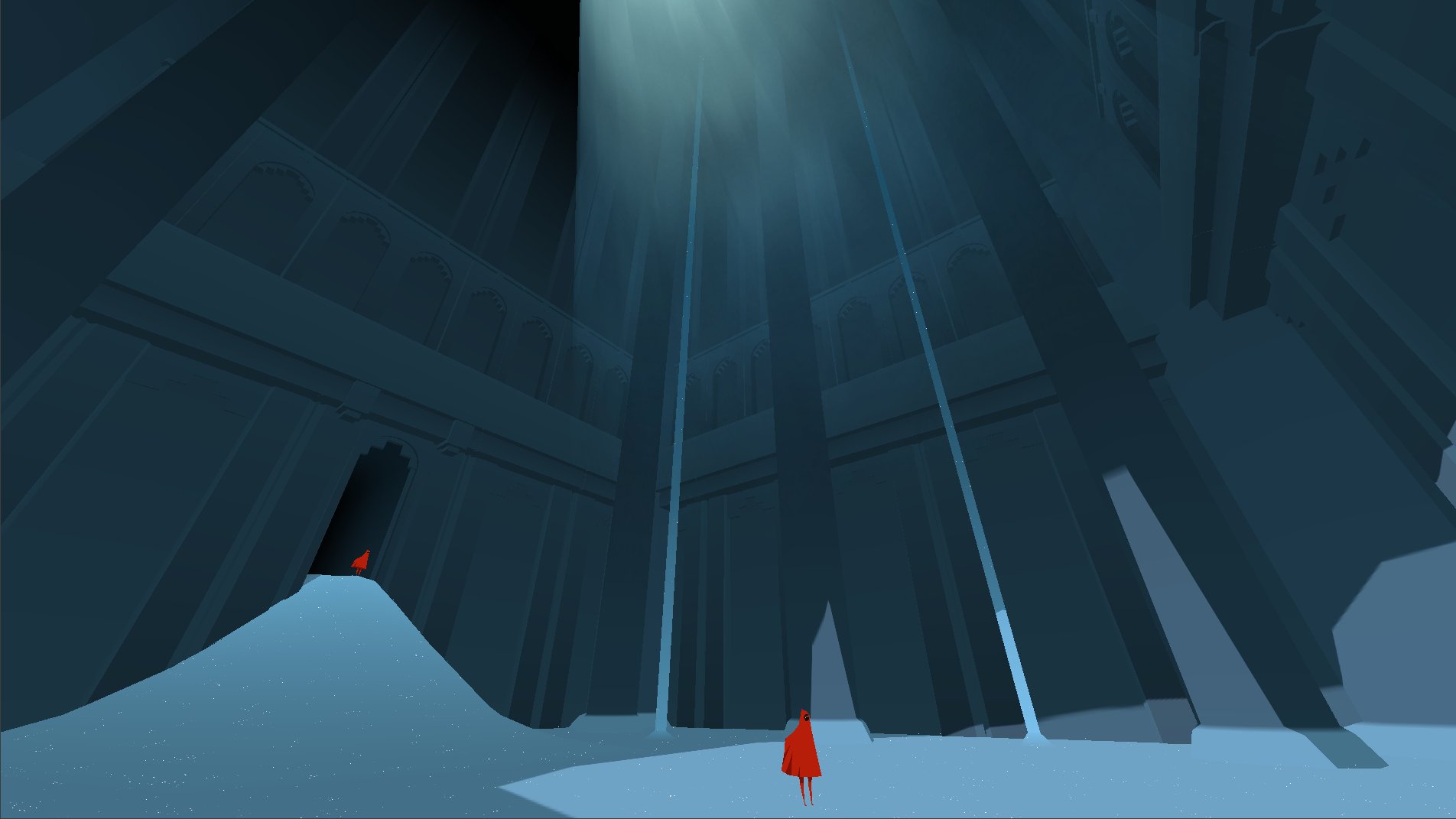
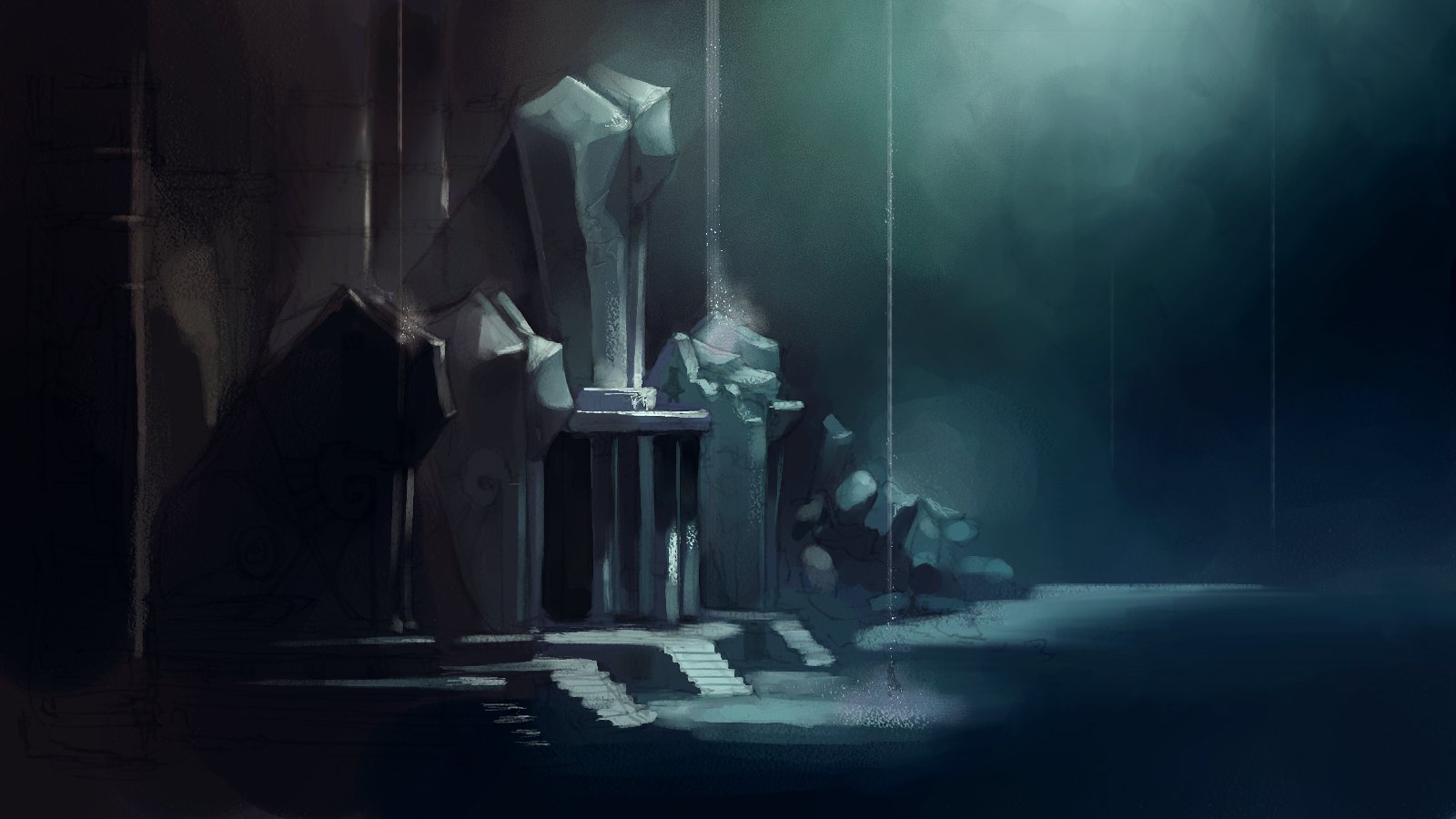
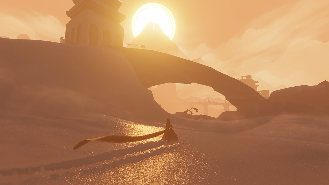
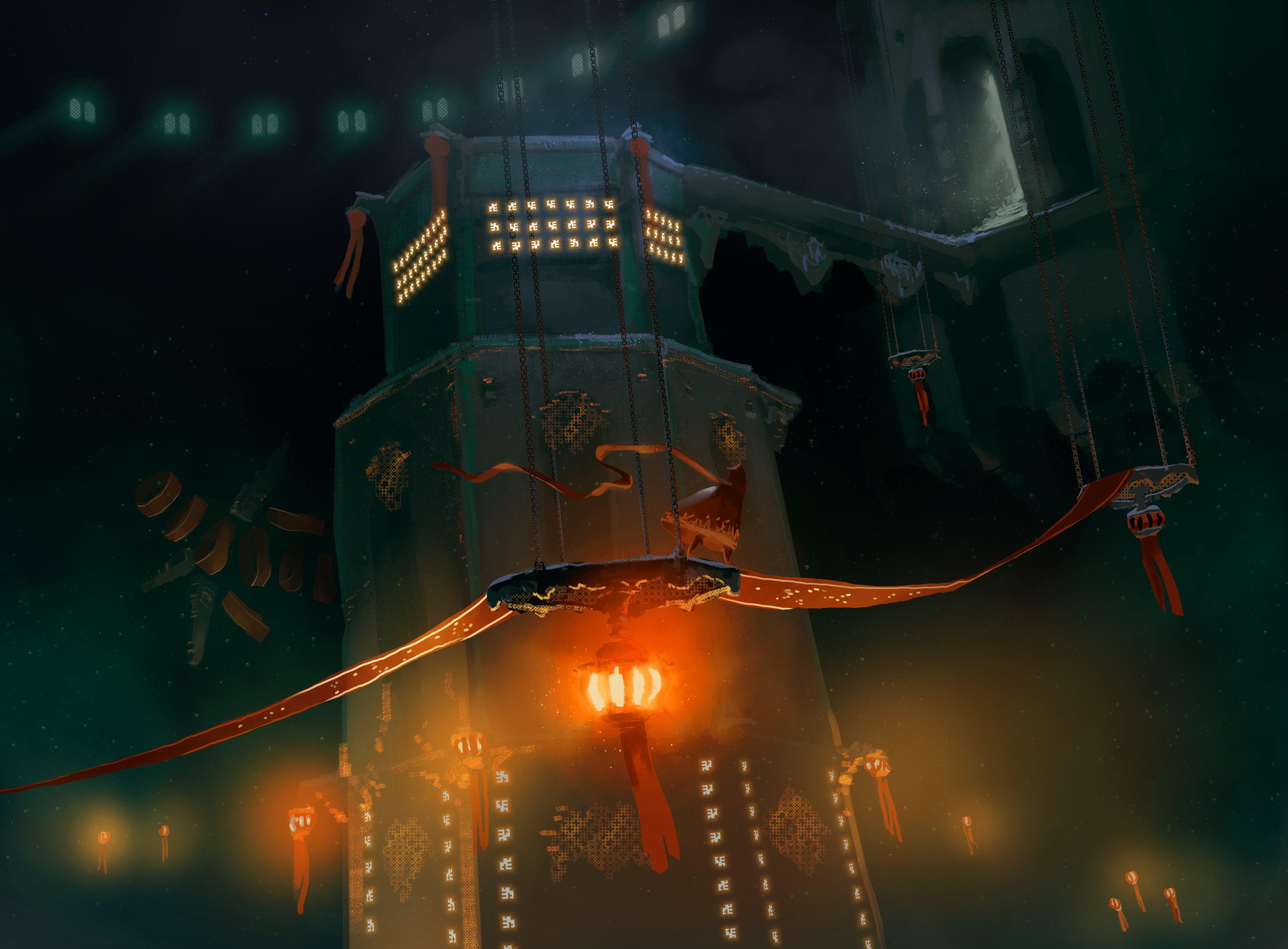
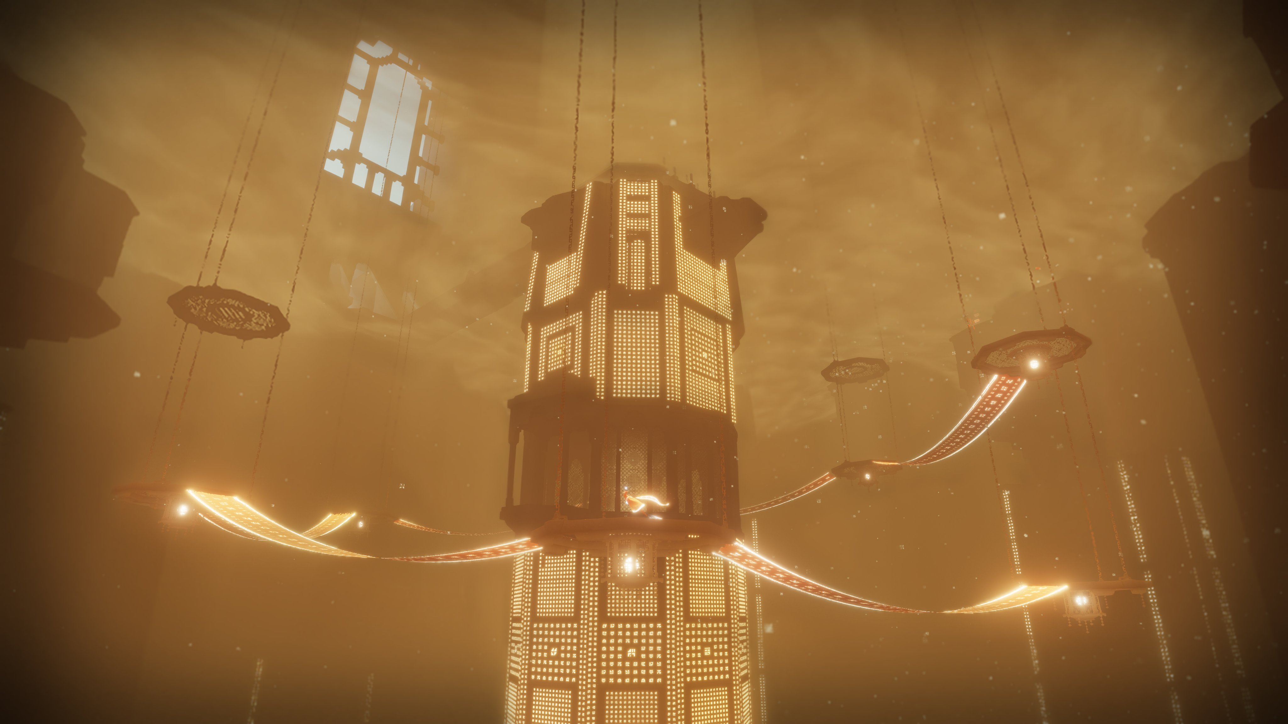
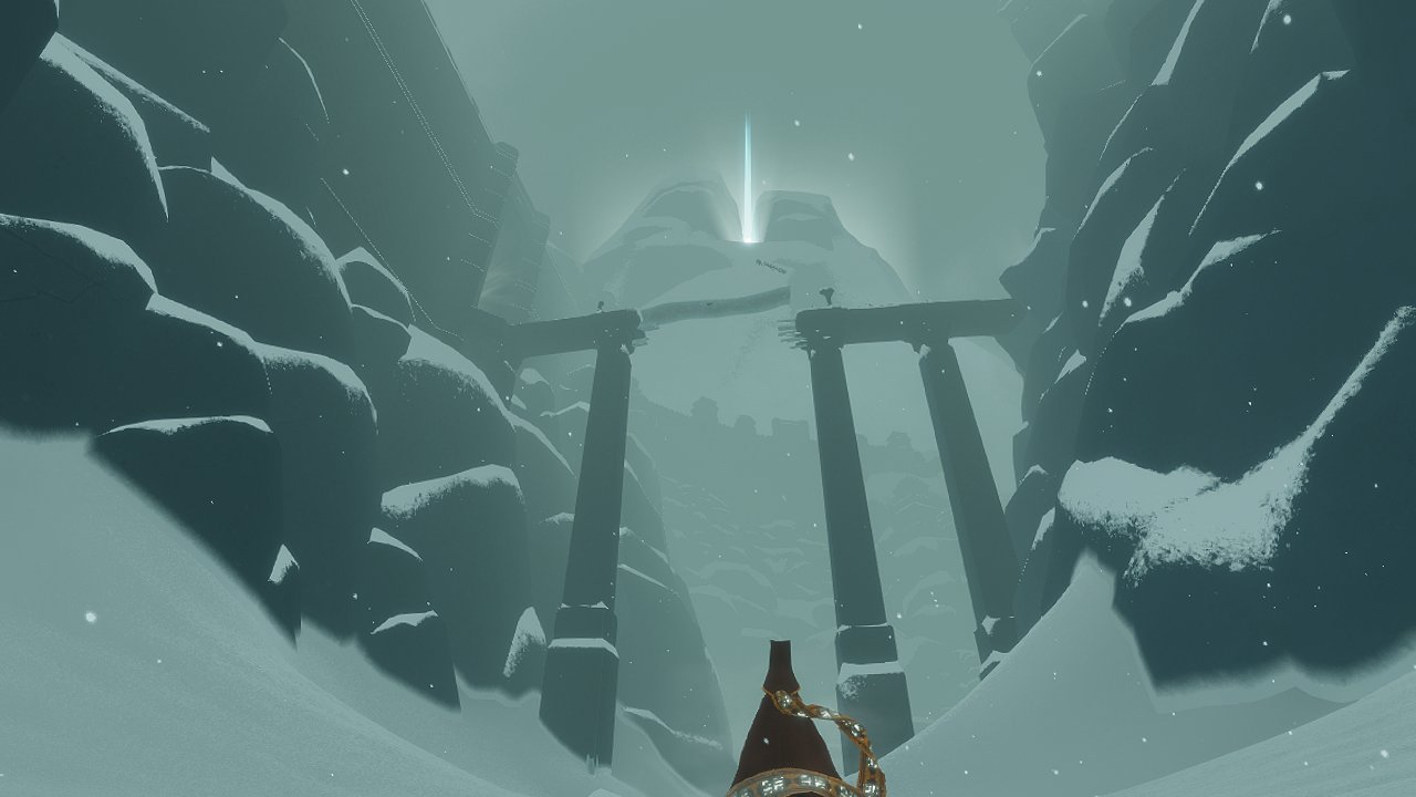
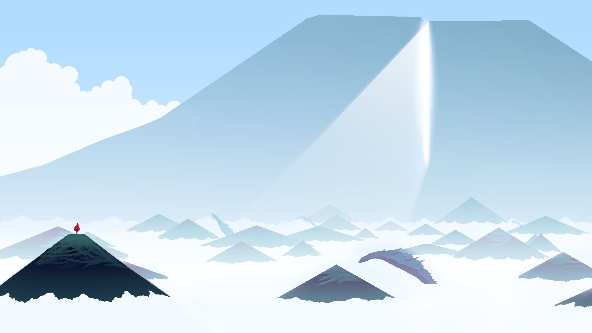
Later in the game you climb a ceremonial tower. My concepts were tinted with cool colors. Later in development I switched it to warm colors, to improve the bigger picture color script of the game. There needed to be a sense of warmth before you head to the cold mountain.
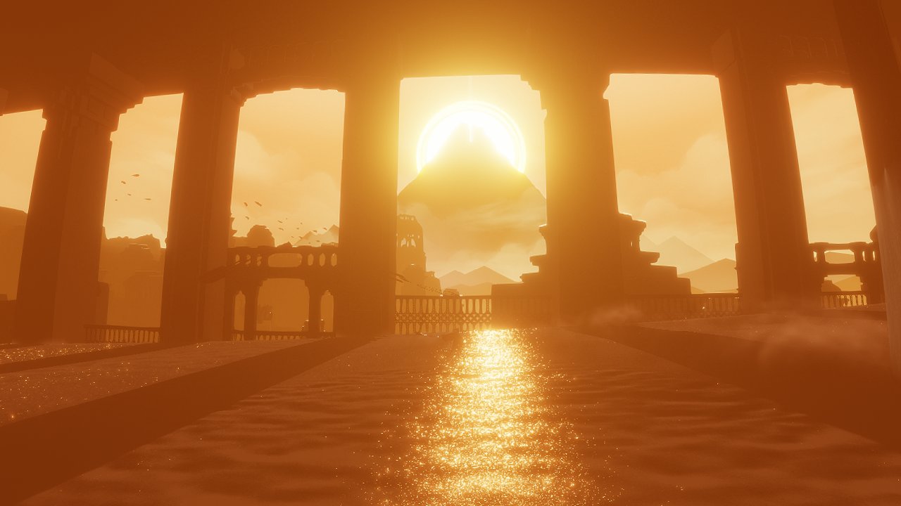
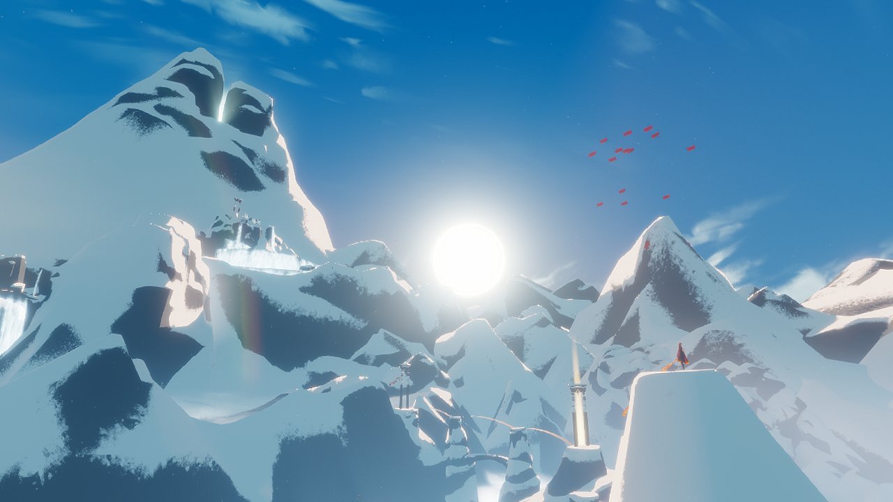
The final entry to the mountain vs 3D mockups I did exploring the color palette.


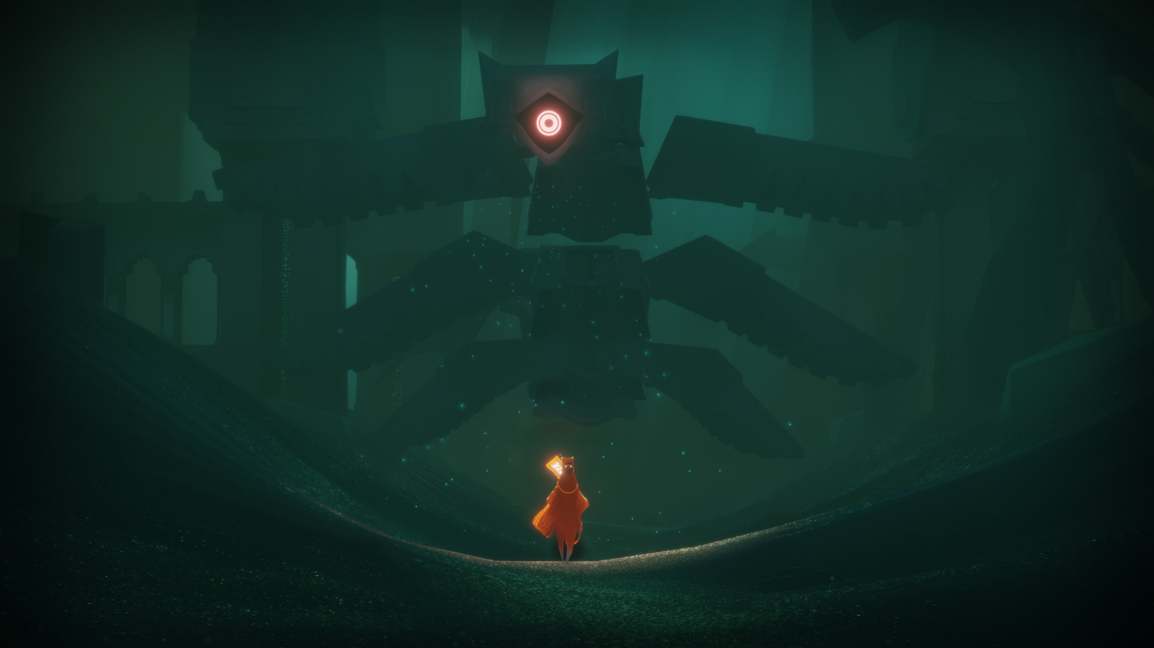
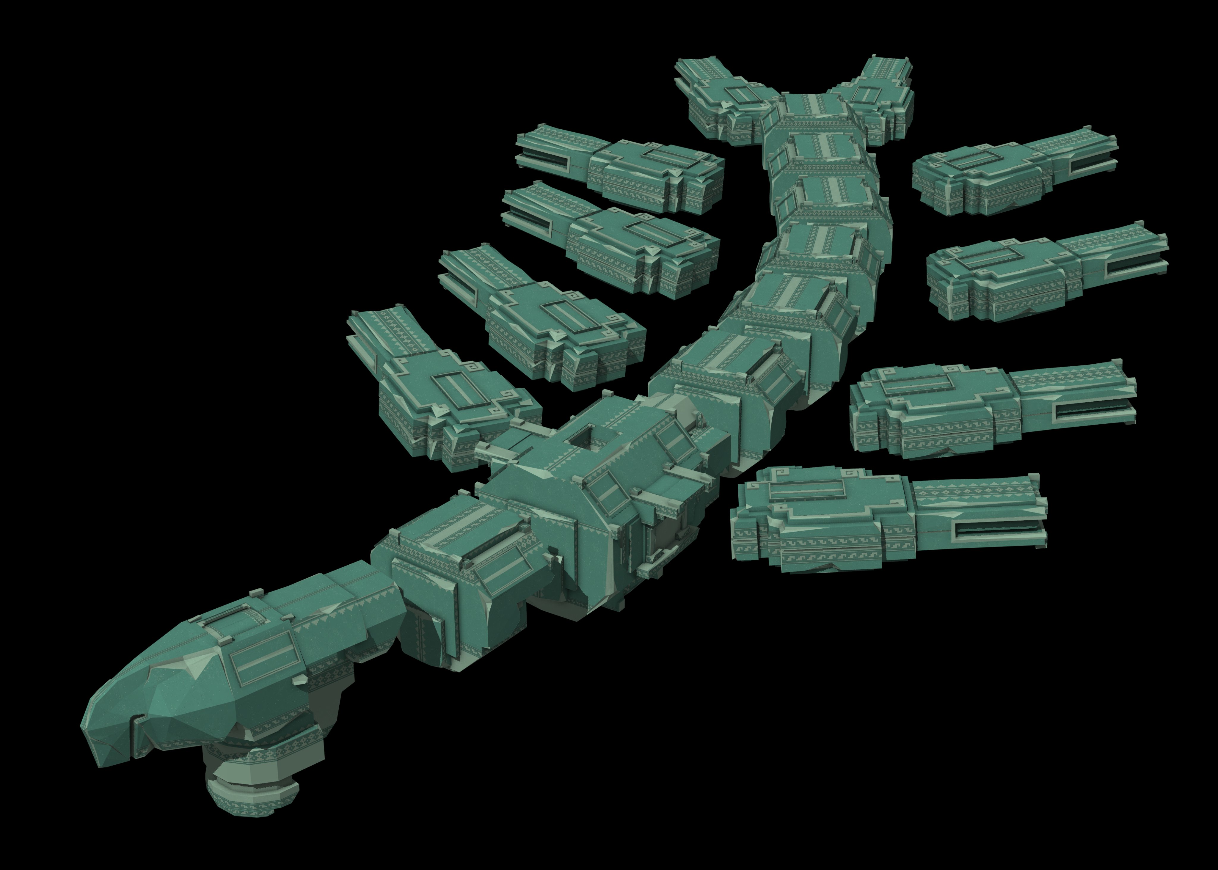
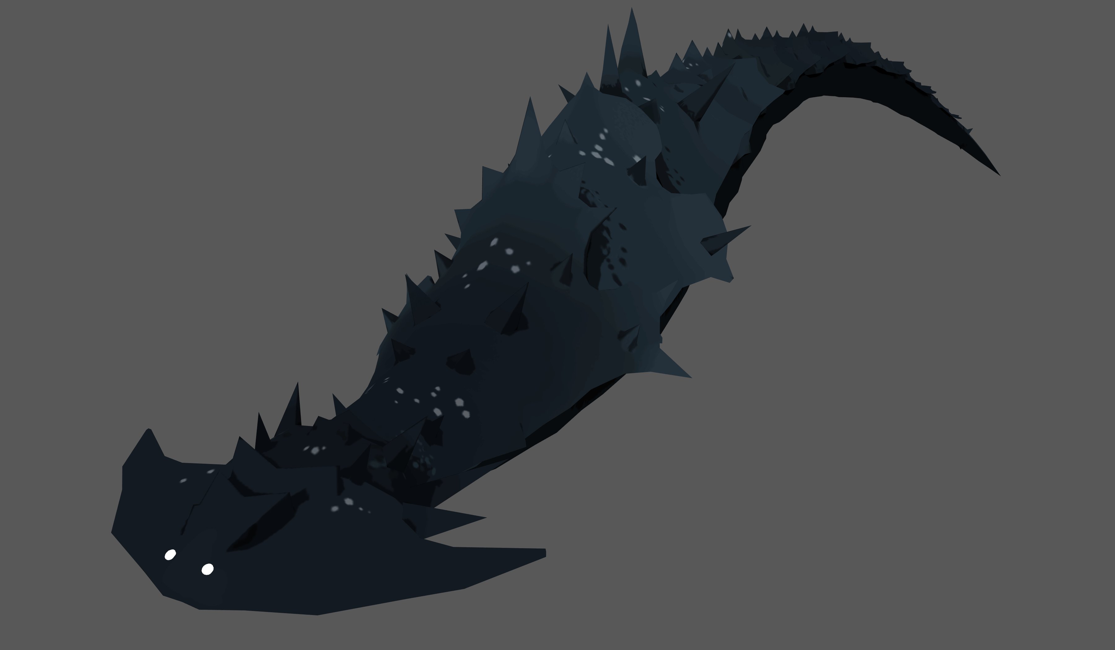
In early prototypes the bad guys were snake-like dragons before they turned into stone beings. The game was actually codenamed "Dragon" in the very early days.
Paintings and 3D mockups I made vs the final level of Journey. This level came in at the very last minute. I still can't believe we pulled it off. We scrapped an on-rails version we hacked in that didnt feel good and got a schedule extension to make it right. Thank goodness.
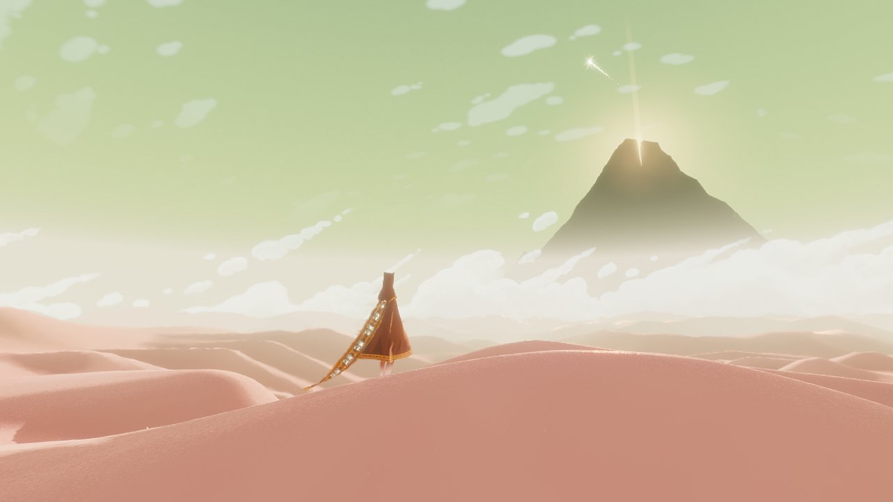
Final moment of the game vs a concept I created during one of the very first days of dev, years before. At the time, I didn't know what the ending would really be. I remember the moment right at the end when we got the timing just right for this. It made the game!

To all who played Journey, thank you! Its been an honor to hear stories about how the game has affected players, and to see the wonderful art people make inspired by it. The game was a very personal story for me, and its incredible that it resonated so deeply. Thank you!